X-bar and R-chart
The main difference between X-bar and R-chart is that an X-bar is used to evaluate if the sample mean is in statistical control. That is, it focuses on analyzing the process mean. On the hand, R-chart indicates if the sample variability is in statistical control. R-chart focuses on the process range. The two charts are commonly used together to evaluate the stability of a process in an organization. Besides, they are used when the data is variable. The two charts are often displayed together in one graph because they are interpreted together to determine if the process is in control. Ideally, the R-chart is reviewed since the disparity in the process should be put under control to enable concurrent examination of the X-bar to establish if the mean of the sample is statistically controllable. This process is adopted because the control limits are approximated using the mean and standard deviation for the X-bar. Thus, if the R-chart is out of control, then the X-bar is also likely to be out of control. Examples of variables that can be measured using these two charts are weight, temperature, and pressure.
P-chart and C–chart
A P-chart makes use of non-conforming items in a sample as the sample statistic. In order to use a P-chart, it should be possible to separate conforming from non-conforming items. Then, the non-conforming items are expressed as a proportion of the total items. On the other hand, a C–chart is used when analyzing the total counts of non-conformities per unit that arise during a sampling period. Under C–chart, the sample is often of a constant size. The two charts are used when the data is a characteristic. A P-chart is often used for quality attributes that are distinct in nature. Besides, these attributes should involve good/bad or yes/no choices. Thus, it focuses on the proportion of faulty units in a sample. On the other hand, a C-chart is used to monitor distinct non-conformities in the event that there is more than one non-conformity in a single unit. Thus, it focuses on the number of defects on each item. The P-chart can monitor attributes such flat tires, late flights, broken eggs per crate, and soil printed logos in a rim. This means that the P-chart is instrumental in progressive monitoring of the above attributes and many more. Examples of attributes that can be measured using a C–chart are the number of monthly customer complaints in a bank and number of defects in a final product such as a car.
Scharadin Hotels Case Solution
Three-sigma control limit
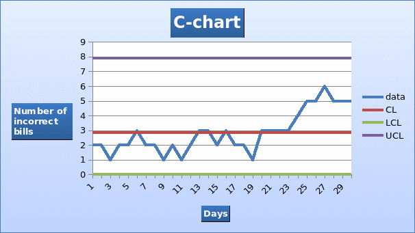
In this case, a C-chart will be suitable to analyze where the process is in control or not. Alternatively, a P-chart may also be used. Calculations of the three-sigma control limit for a C-chart are presented below.
Control limit = number of complaints / number of samples = 85 / 30 = 2.833
Upper control limit = control limit + z√ control limit = 2.833 + 3√2.833 = 7.8831
Lower control limit = control limit – z√ control limit = 2.833 – 3√2.833 = -2.216
The lower control limit is a negative value. Therefore, it will be rounded up to zero because there are no negative control limits. The C-chart for the process is displayed below.

Stability of the process
In most cases a process is considered to be in control if all the data points lie within the upper and lower control limit. In this case, all the data points lie within the two control limits. However, a further review of the chart shows that the process is out of control because the last consecutive eleven points are above the control limit. It is worth mentioning that the chart is based on a normal distribution. Further, about half of the data points are above average. This indicates a trend which implies that the statistical process is not stable.
Is the problem the new system?
A review of the control limits shows that the problem is not the new computer system. The system was in place since the beginning of the month but the problem started happening from the third week. Therefore, the problem may be due to other reasons.
Recommendation
A further analysis needs to be carried out in order to find the cause of the problem. Specifically, the analysis needs to focus on the changes that occurred from the third week of the month. Specifically, the management needs to look for incorrect bills that were issued in the fourth and the third week to ascertain if a common factor exists. For instance, the management can try and verify if the incorrect bills were issued by new employees. This can be indication that the new employees do not know how to use the system properly. In this case, a recommendation should be made to train the new employees.